View
Drag


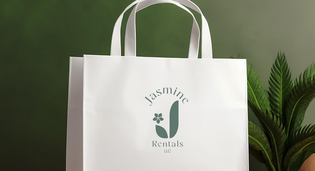
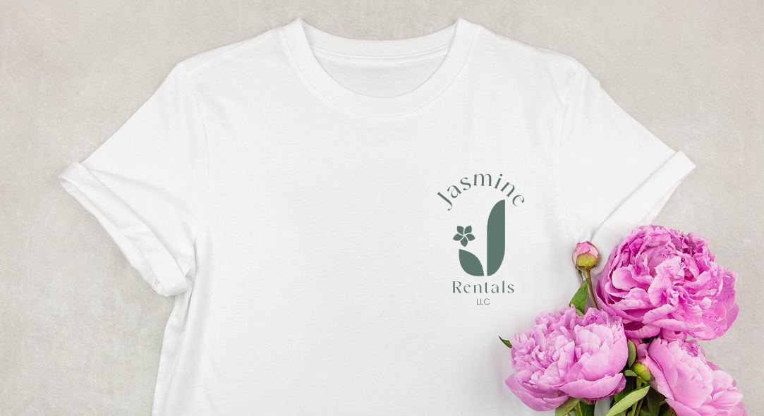
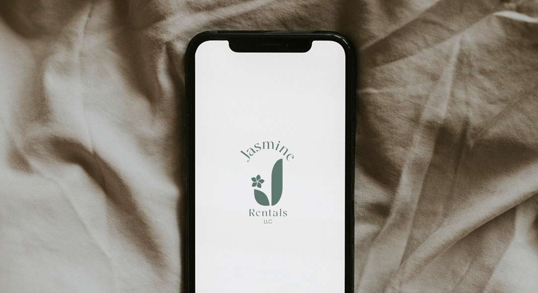
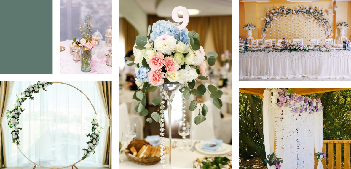
Jasmine Rentals approached us with an existing logo that was overly complex, featuring too many colors and elements. This design hindered scalability across various mediums and lacked a modern aesthetic, making it less effective in conveying the brand's message and appealing to their target market.
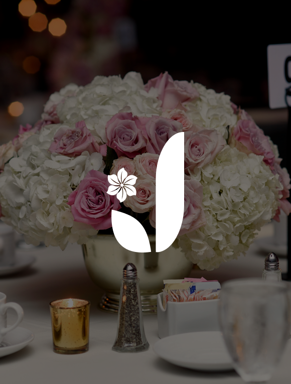
The new Jasmine Rentals logo embodies a clean and modern aesthetic, featuring a minimalist design with a focus on elegance and cultural significance. The logo combines a soft sage green color palette with a refined font, creating a sophisticated and approachable look.
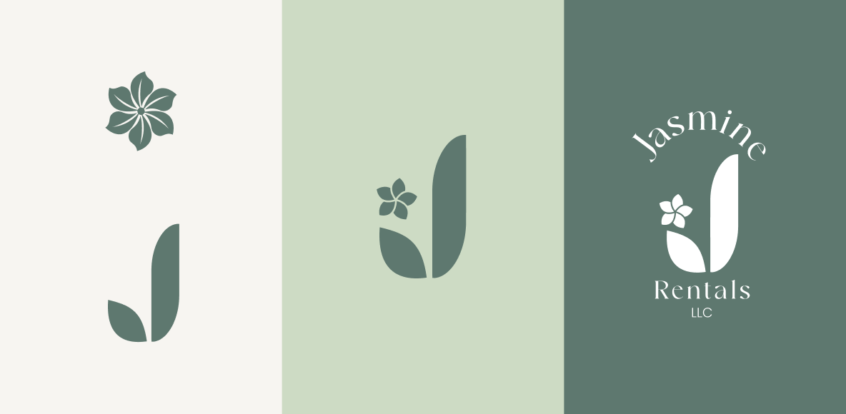
By focusing on clean lines, a limited color palette, and meaningful symbolism, we aimed to create a logo that is both timeless and versatile. This approach ensures the brand stands out in a competitive market, resonates with a diverse audience and effectively communicates the company’s values and offerings.