View
Drag

Human Hoist approached us with an established logo that featured an overly detailed icon, making it difficult to scale and modernize across various platforms. The challenge was to simplify the icon while maintaining its core essence and aligning it with the company’s mission and product offerings.
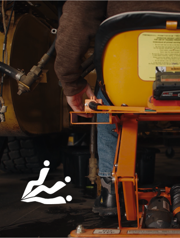
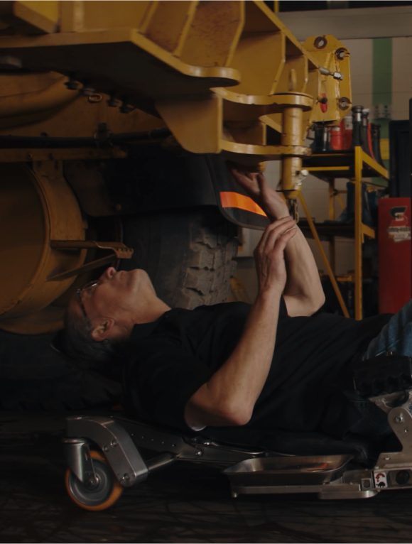
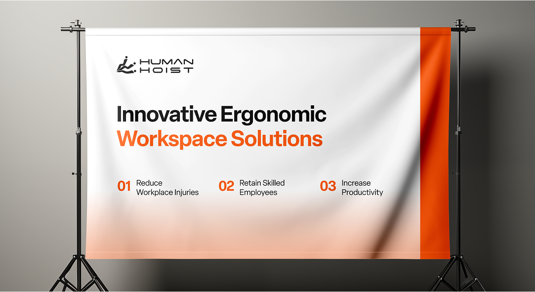
The redesigned logo modernizes the existing icon by illustrating a "person" in three key positions - sitting, transitioning and lying flat - mirroring the functionality of the Human Hoist Chair. The use of orange reflects the industrial nature of their products, creating a bold and instantly recognizable visual identity.
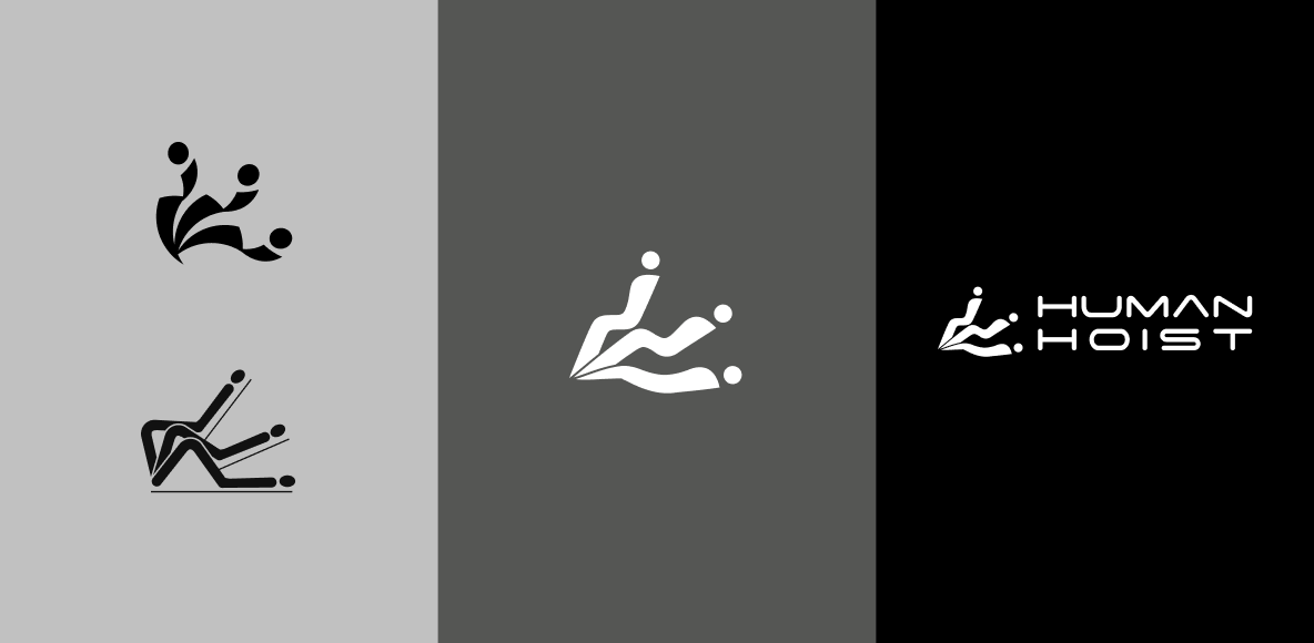
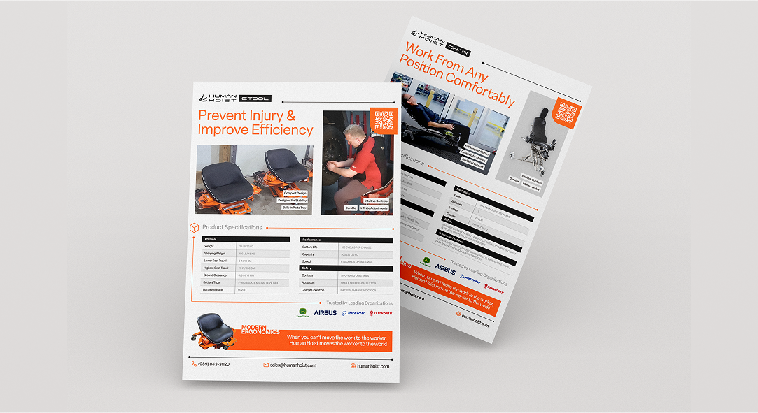
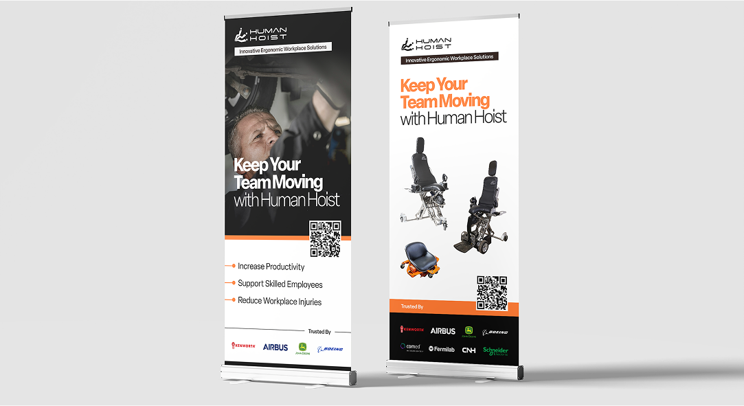
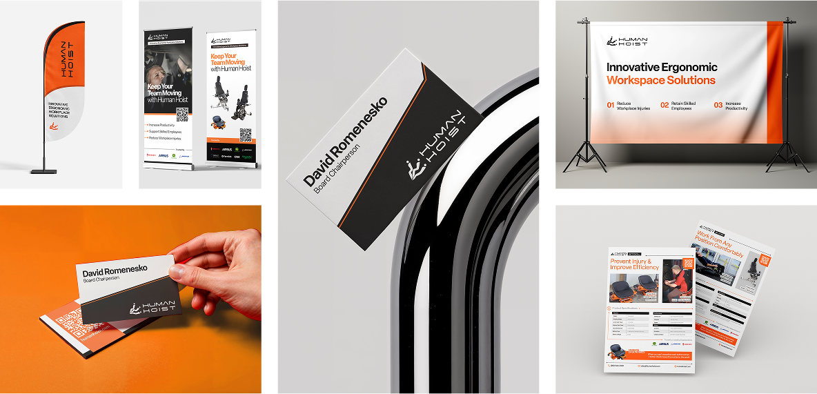
The Human Hoist brand uses bold, functional design to reflect the innovation and reliability of their products. Each application, from equipment to print, maintains a consistent look that reinforces safety, adaptability and performance.