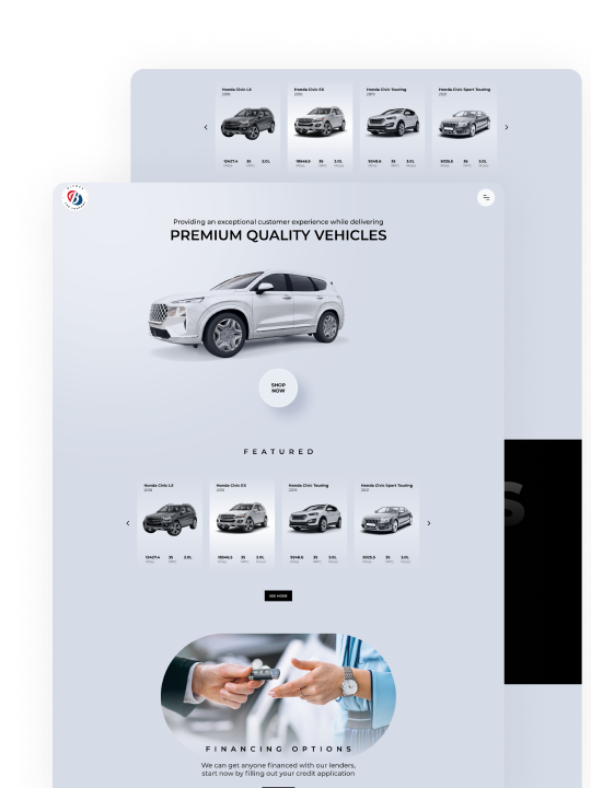
View
Drag

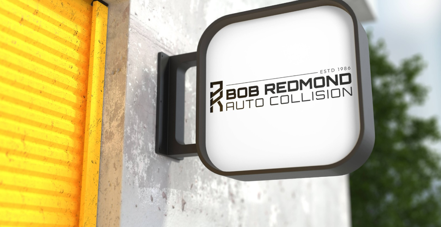
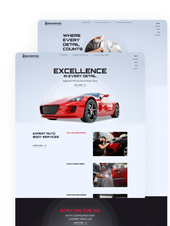
Bob Redmond Auto Collision came to us with an outdated logo that lacked scalability and modern appeal. Our challenge was to refresh their brand identity to reflect their long-standing reputation while updating their look to align with today’s design standards.
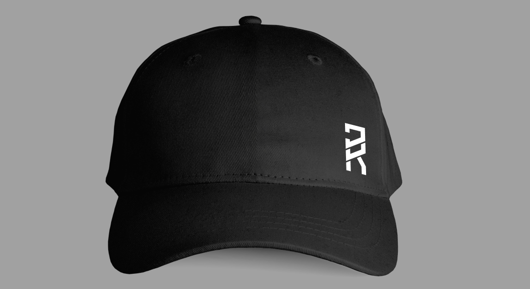
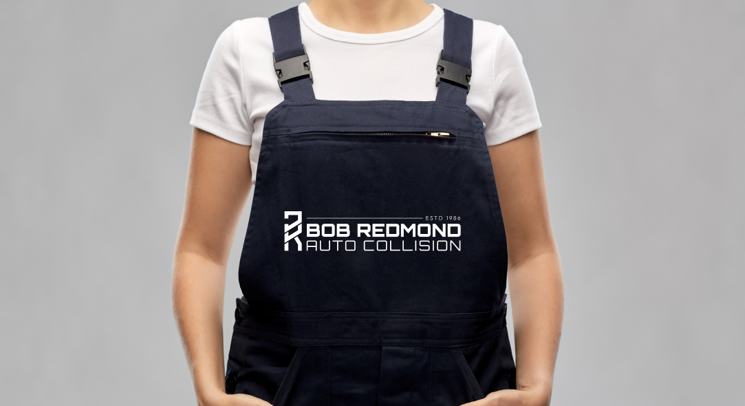
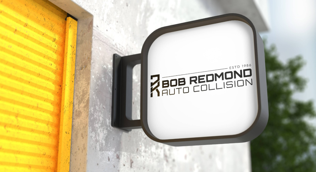
Bob Redmond Auto Collision’s new look balances strength with simplicity. Clean lines, bold type and a grounded color palette create a sharp, professional impression - designed to stand out across signage, print and digital without losing the grit and trustworthiness of a local shop.
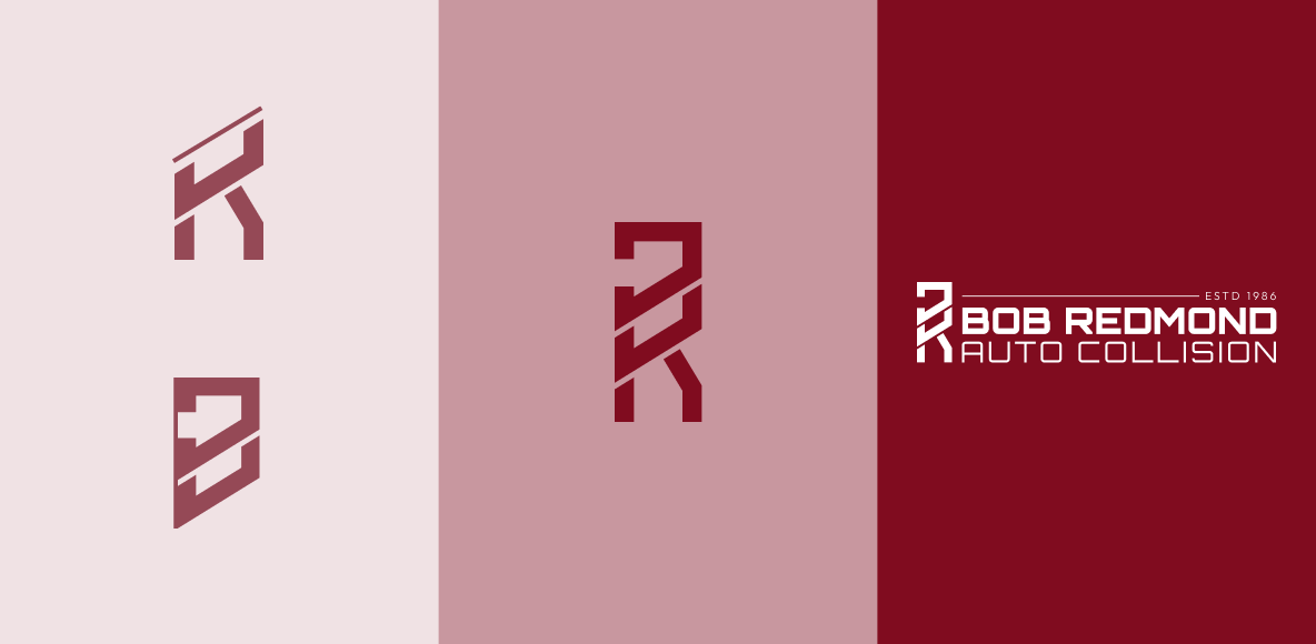
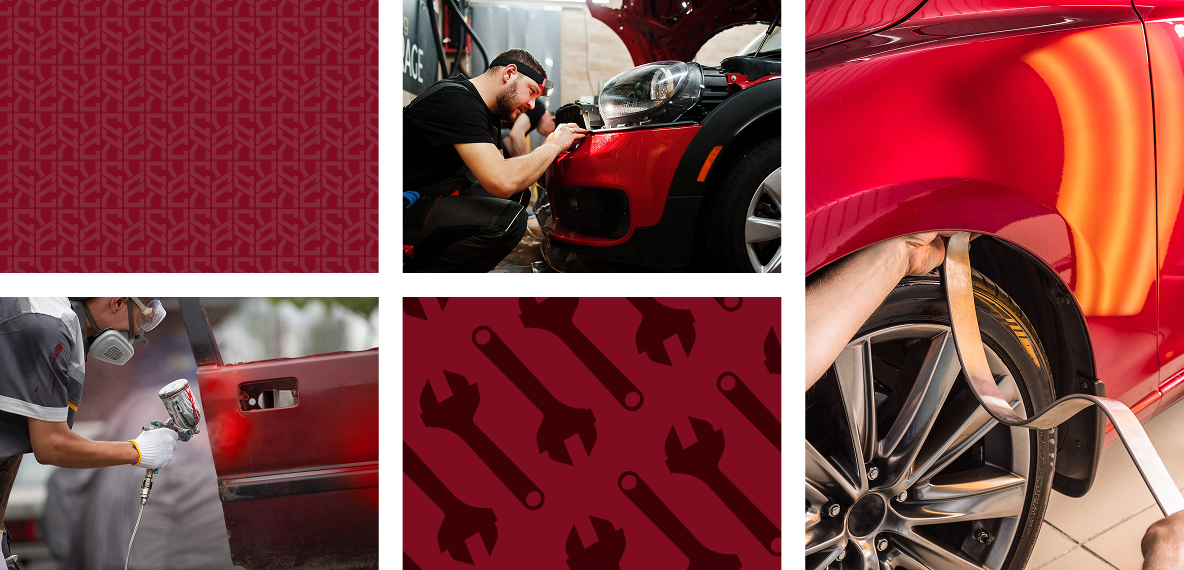
The brand identity blends modern grit with legacy. A bold icon and industrial typeface anchor the design, while deep blues and fiery red-orange accents reflect trust, energy and craftsmanship. The nod to “ESTD 1986” reinforces the brand’s roots and long-standing reputation for quality repair work.