

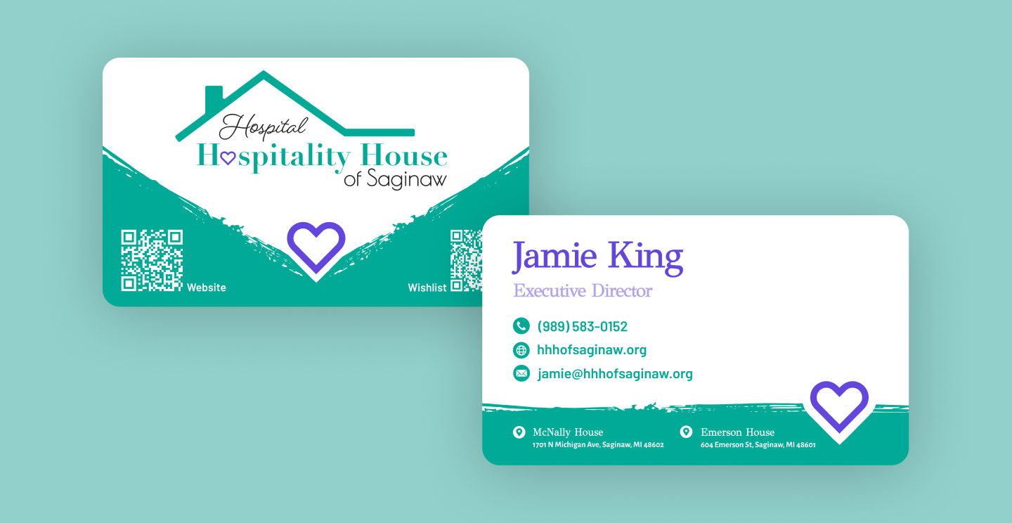
Hospital Hospitality House of Saginaw approached us with a logo that felt overly institutional and failed to capture the mission of their organization. The existing design did not communicate their commitment to providing comfort and support to families during medical challenges, which was crucial to their brand identity.

The new logo blends clean, modern design with symbols of shelter and care. A teal roof outline conveys protection, while a heart in “Hospitality” adds warmth and empathy. Paired with elegant fonts and a calming color palette, the design creates an inviting presence.
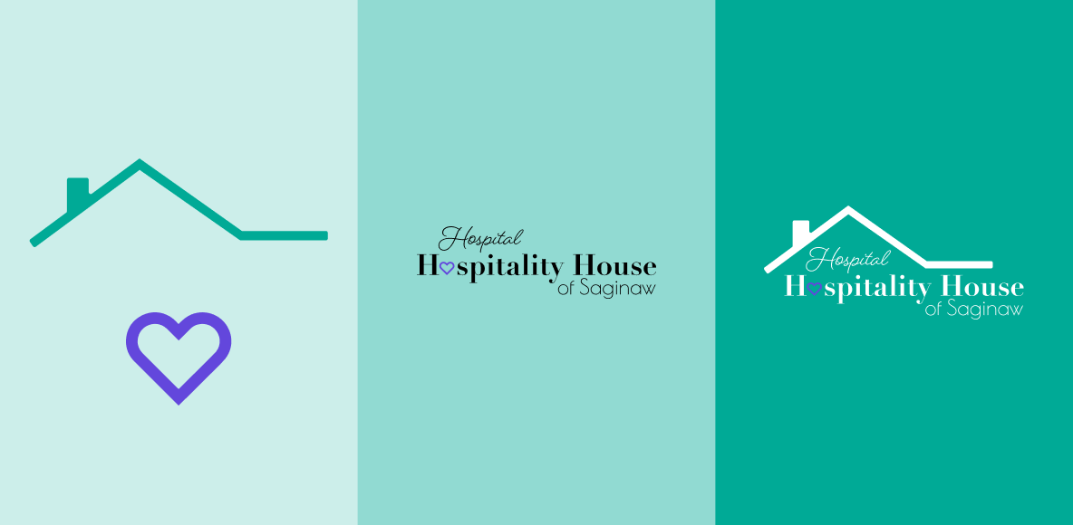
The new brand identity was built to reflect the organization’s role as both a safe haven and a source of compassion for families in medical crisis. Every design choice, from the protective roof shape to the integrated heart, was made to reinforce their mission of shelter, care and support.
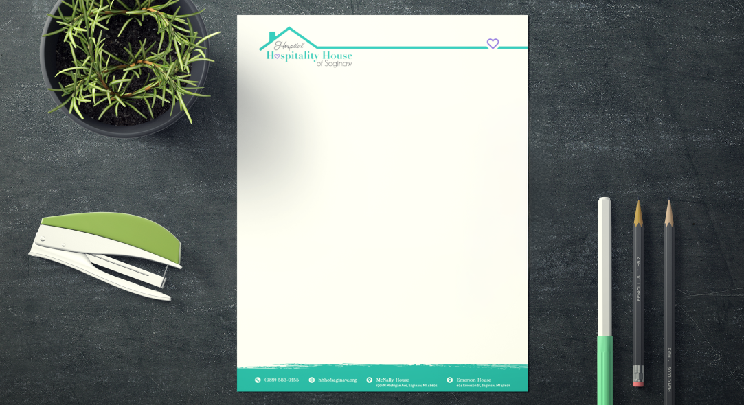
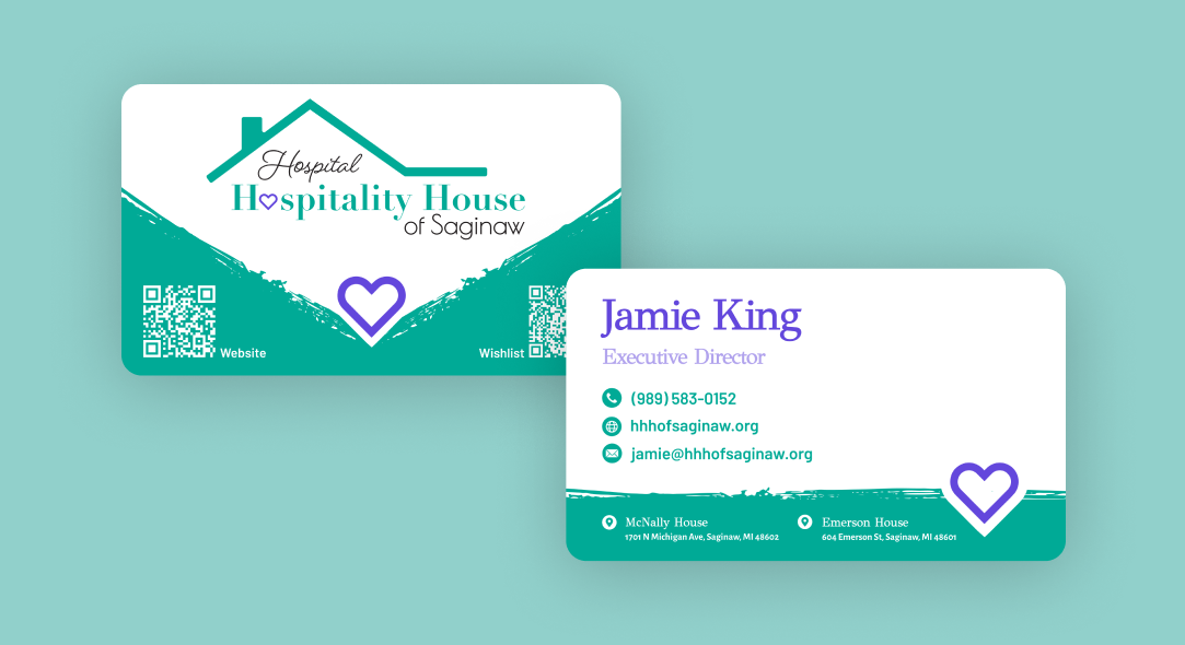
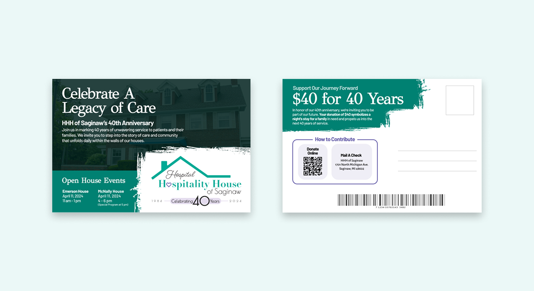
The brand elements center on meaningful symbolism that reinforces the mission. The roof outline represents shelter and stability, while the heart conveys compassion and care. These icons work seamlessly across print and digital applications, ensuring the visual identity remains recognizable and emotionally resonant in every use.


The Hiero team was great to work with! From totally redoing our website, to creating a new logo for our organization as well as one for our annual fundraiser, to designing letterhead, envelopes, and business cards. They got everything back to me quickly, listened to all of my feedback, and answered all of my questions! I'd recommend them to anyone else looking for design work in the GLBR!

Jamie King, Executive Director
View Website
